Ever opened a new prescription bottle, glanced at the little sticker on the side, and thought, What does this even mean? You’re not alone. Millions of people ignore, misunderstand, or completely miss the warnings on their medication labels-sometimes with dangerous results. These aren’t just random notes. They’re legally required safety messages designed to keep you alive. But if you can’t understand them, they might as well not be there.
Why These Warnings Exist
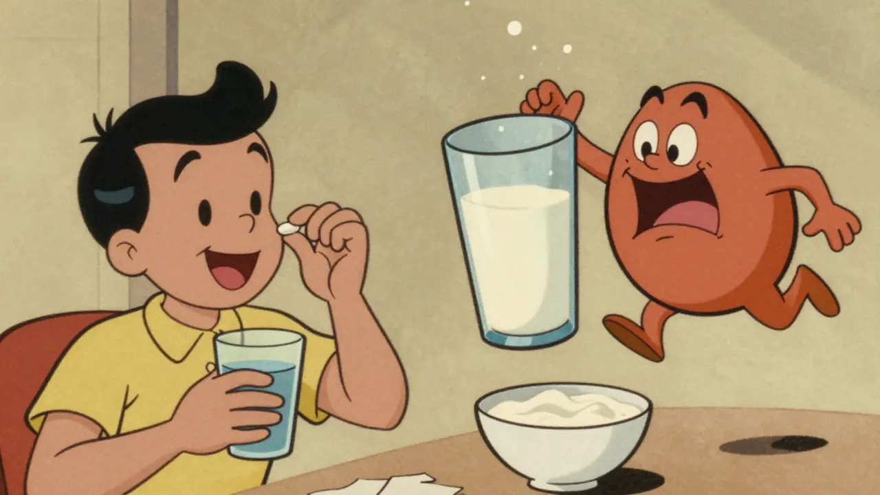
Every prescription sticker you get is there for one reason: to stop you from getting hurt. The U.S. Food and Drug Administration (FDA) requires them under federal law. These aren’t suggestions. They’re rules. And they’re not just for doctors or pharmacists-they’re meant for you.Medication errors cause over 1.3 million injuries every year in the U.S. That’s more than car accidents. About 7,000 of those cases end in death. A lot of those errors happen because someone didn’t know they couldn’t mix their blood pressure pill with grapefruit juice, or that their antibiotic needed to be taken on an empty stomach. The FDA says if patients understood their labels better, up to half of all bad reactions could be avoided.
But here’s the problem: most people don’t understand them. One study found only 55% of patients got the meaning right. That’s less than even odds. Meanwhile, pharmacies fill over 3.8 billion prescriptions a year. If even a quarter of those labels are misunderstood, we’re talking about millions of people taking pills wrong.
What the Colors Mean (And Why They Don’t Always Work)
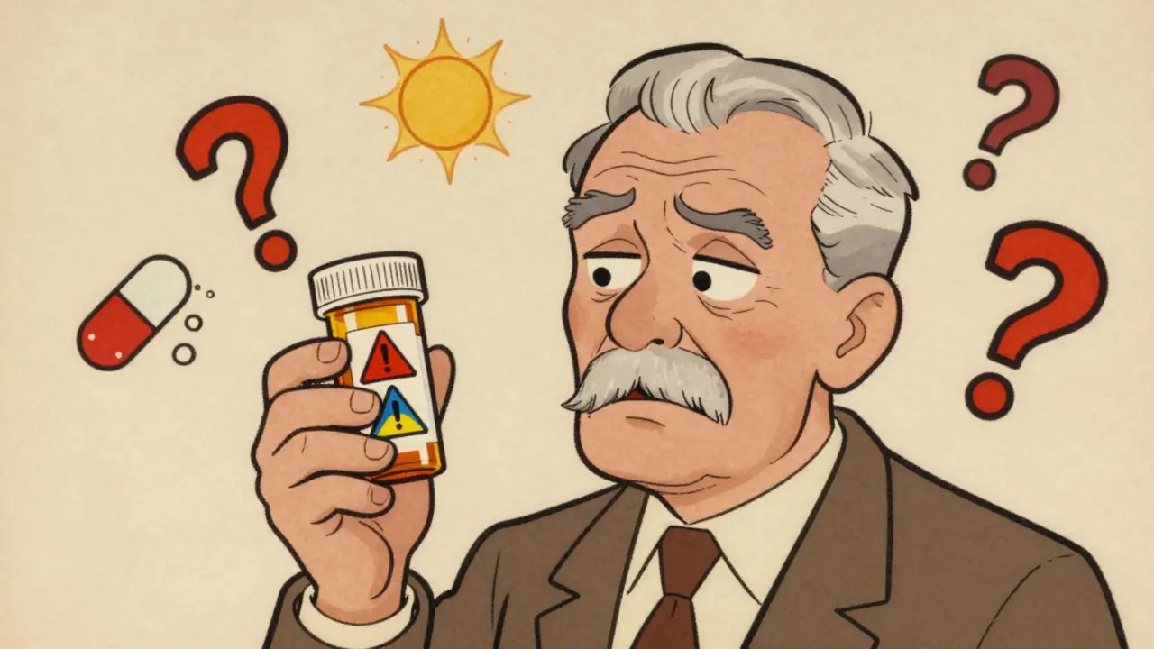
You’ve probably noticed the colors. Red. Yellow. Blue. White. It feels like there’s a code, right? Red means danger. Yellow means be careful. Blue? Probably just a reminder.That’s what most people think. And it’s partly true. A study found 42% of patients automatically assume red means "serious risk" and yellow means "caution." But here’s the catch: not every pharmacy uses the same system. Some use red for everything. Others don’t use color at all. And some stickers are printed in black ink on white paper-no color at all.
Even when color is used, it’s not foolproof. One study showed that blue labels-meant to be "neutral"-were misread as "optional" by nearly half the people who saw them. That’s dangerous. If you think a warning is just a suggestion, you might skip it. And that’s how people end up in the ER after mixing their blood thinner with ibuprofen.
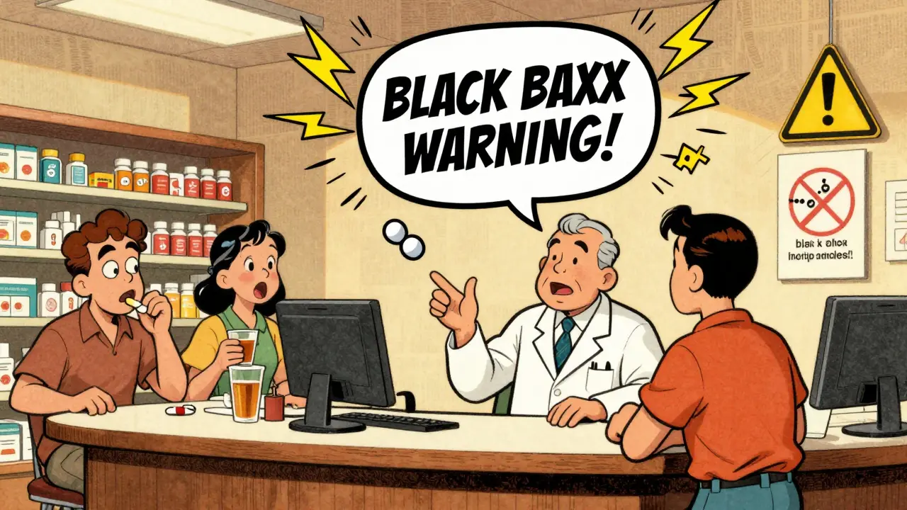
Black Box Warnings: The Red Flag You Can’t Ignore
The most serious warning you’ll ever see on a prescription is the Black Box Warning. It’s called that because it’s printed in a thick black border at the top of the drug’s official prescribing info-and sometimes, it’s copied onto the pharmacy label too.This isn’t just a caution. It’s a red alarm. The FDA requires it when a drug has been linked to serious, life-threatening side effects. Think liver failure, heart attack, suicidal thoughts, or severe allergic reactions. About 40% of new drugs approved between 2013 and 2017 had one.
If your pill has a Black Box Warning, you need to know what it says. Don’t just skim it. Read it out loud. Ask your pharmacist to explain it. If you’re on a medication like warfarin, lithium, or certain antidepressants, this warning could be the difference between life and death.
Common Warnings-and How People Get Them Wrong
Here are the warnings you’re most likely to see-and the mistakes people make every single day.- "Take on empty stomach" - Means at least one hour before or two hours after food. But 60% of patients think "don’t eat right after" means they can eat before. That changes how the drug is absorbed. Some antibiotics become useless if taken with food.
- "Do not crush or chew" - Many people think this means "chew it so it works faster." In reality, crushing a time-release pill can dump the whole dose into your system at once. That’s how overdoses happen.
- "Refrigerate" - Not all medicines need cold storage. But if yours says it, don’t leave it on the counter. Heat can break down the medicine. The fridge should be between 2°C and 8°C (36-46°F).
- "Avoid sunlight" - This isn’t about sunburn. Some drugs make your skin ultra-sensitive. One hour in the sun can cause a serious burn. People ignore this and end up with second-degree burns on their arms and neck.
- "Take with food" - The most ignored warning. People think it’s just to avoid stomach upset. But for some drugs, food helps your body absorb them. Without it, the medicine doesn’t work. One study found 42% of patients skipped this instruction.
- "Do not operate heavy machinery" - This usually means the drug causes drowsiness. But people think, "I’m just driving to work-it’s only 10 minutes." That’s how accidents happen.
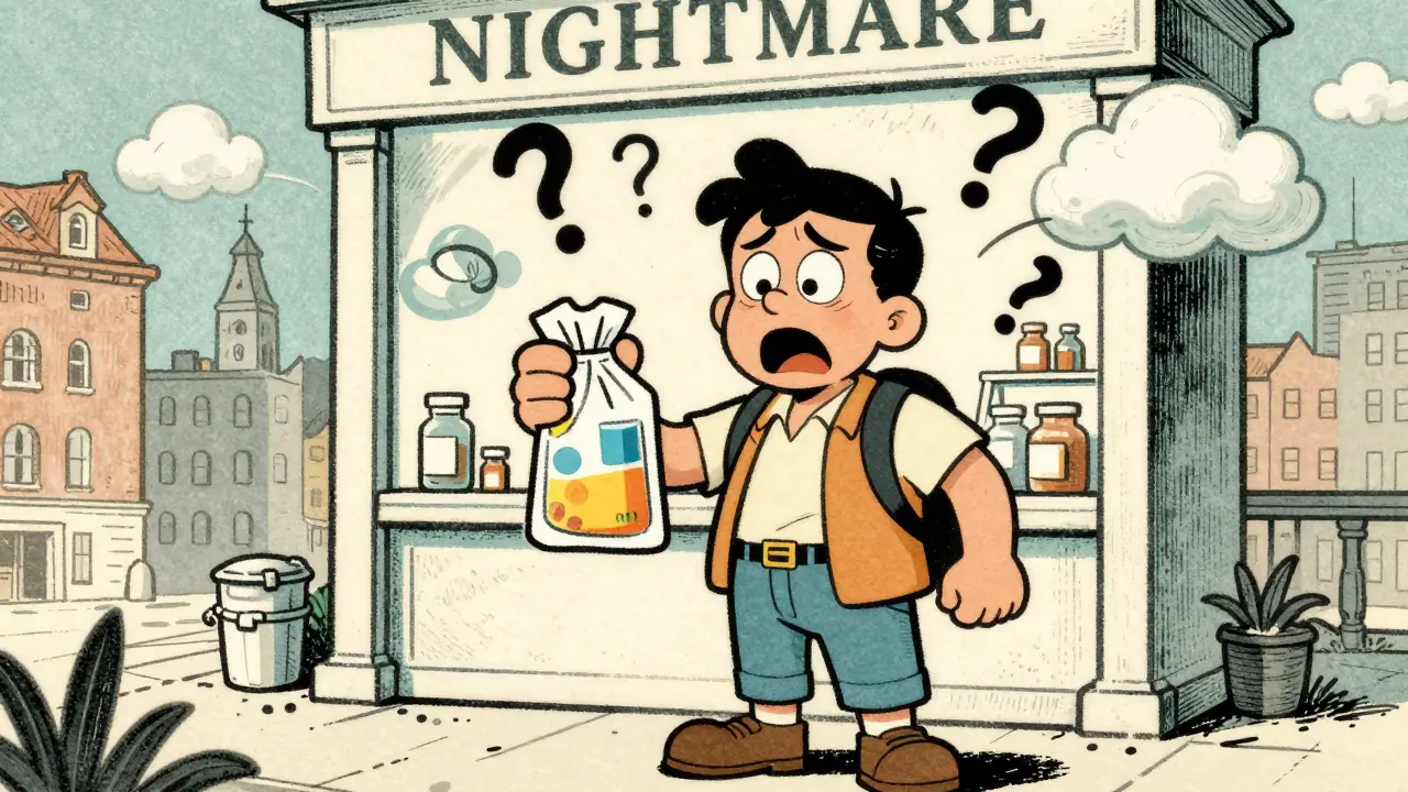
And here’s the weirdest one: "For external use only." In a study, 91% of people didn’t understand it. Some thought it meant "apply to skin," others thought it meant "don’t swallow"-but 28% thought it meant "don’t touch it." One man put his eye drops on his arm because he thought "external" meant "not for eyes."
Why Symbols Fail (And What Works Better)
You’ve seen the little icons: a glass with a slash through it (don’t drink alcohol), a skull (danger), a sun (avoid sunlight). They’re meant to be universal. But they’re not.A study found that the "do not crush" symbol-a pill with a crack through it-was misread as "radioactive" by 32% of people. Another symbol, a fork with a slash, was confused for "don’t eat at all." One woman told her pharmacist she refused to take her pill because the sticker showed a "warning sign for poison." It was just a "take with food" symbol.
So what works? Verbal explanation + simple text. When pharmacists sit down and explain the warning in plain language-"This makes you sleepy, so don’t drive"-comprehension jumps to 92%. When patients are asked to repeat the instructions back in their own words (called the "teach-back" method), understanding improves by 47%.
Some pharmacies are starting to use QR codes on labels. Scan it, and a short video plays explaining the warning in simple terms. Early results show it cuts misunderstanding by more than half.
The Real Problem: Health Literacy
It’s not that people are lazy. It’s that many don’t have the skills to understand medical language.Only 12% of U.S. adults have proficient health literacy. That means 88% struggle with basic medical terms. Words like "contraindicated," "adverse reaction," or "drug interaction" might as well be in another language.
And it’s worse for older adults. One patient, 68, told a pharmacy she threw away the paper that said not to take her blood pressure pill with grapefruit juice. "I didn’t think it was important," she said. Two days later, she ended up in the ER with dangerously low blood pressure.
Pharmacies with structured counseling programs-like Walgreens’ "Medication Safety Check"-see 92% comprehension. Independent pharmacies without those programs? Only 68%.

What You Can Do Right Now
You don’t have to wait for the system to fix itself. Here’s how to protect yourself:- Check the pill. Does the shape, color, and imprint match what’s on the label? If not, ask. Pills can be switched accidentally.
- Read the sticker out loud. Don’t just glance. Say it. If you don’t understand it, say so.
- Ask the pharmacist: "What’s the most important thing I need to know about this?" Don’t ask for all the details. Ask for the one thing that could hurt you.
- Use the teach-back method. After they explain, say: "So if I understand right, I shouldn’t drink alcohol because it makes me dizzy?" Then they’ll correct you if you’re wrong.
- Save the Patient Prescribing Information sheet. Even if it’s bulky, keep it. It has the full warning list. Don’t throw it away.
What’s Changing (And When)
The FDA is finally trying to fix this. In 2022, they launched the "Facts Label" initiative. By June 2025, the 20 riskiest drugs-like blood thinners, diabetes meds, and opioids-must have a simplified, easy-to-read label. No jargon. No tiny print. Just plain English.In February 2023, the FDA approved a new set of standard icons. The "do not crush" symbol is now a pill with a hammer hitting it. It’s clearer. Testing showed misinterpretation dropped from 31% to just 8%.
By 2026, most pharmacies will be required to use these new standards. But until then, you’re your own best defense.
Final Thought: Your Life Is on That Label
That little sticker isn’t bureaucracy. It’s a lifeline. It’s the last line of defense between you and a serious mistake. And right now, the system is failing too many people.You don’t need to be a doctor to understand it. You just need to slow down. Ask questions. Don’t assume. And never ignore a warning because it looks "too complicated." If you’re unsure, call your pharmacy. They’re paid to help you-not just fill the bottle.
Medicine can save you. But only if you take it right.
Meghan O'Shaughnessy
December 17, 2025 AT 14:56So many people just glance at those stickers like they're cereal box nutrition facts. I once took my blood pressure med with grapefruit juice because I didn't think it mattered. Ended up in the ER with my heart doing the cha-cha. Don't be that person. Read the damn thing.
And yes, the colors are useless. My pharmacy uses red for everything, even "take with food." It's chaos.
Kaylee Esdale
December 18, 2025 AT 08:28My grandma threw away her warfarin bottle because the sticker had a skull. She thought it meant "poison." She didn't know it was a black box warning. She's fine now, but man. We need better labels. Plain words. No symbols. Just talk to people like humans.
Also, teach-back works. My cousin learned her diabetes meds by repeating it back to the pharmacist. Changed her life.
Jody Patrick
December 19, 2025 AT 06:15Another liberal health panic. People are dumb, not the system. If you can't read a label, don't take pills. Simple. Stop blaming pharmacies. Get your act together.
Radhika M
December 20, 2025 AT 20:33In India, we don't have color-coded stickers at all. Just plain text in English and local language. But pharmacists sit with you. Explain everything. No QR codes needed. Just human talk. Maybe the US should try that instead of overdesigning labels.
Also, "external use only" - my aunt once put eye drops on her wrist because she thought "external" meant "not for inside body." We laughed. Then we cried.
Jonathan Morris
December 22, 2025 AT 09:16This is all a government ploy. The FDA doesn't care if you understand your meds - they care if you stay dependent on them. Black Box Warnings? Designed to scare you into compliance. The "teach-back" method? A way to make you feel guilty for not being a medical expert. QR codes? Tracking your medication habits. Wake up.
And don't get me started on the 2025 "Facts Label" mandate. That's just Step 1 of the pharmaceutical surveillance state.
Donna Packard
December 22, 2025 AT 15:35I used to ignore labels too. Then my mom had a bad reaction. Now I read every word. Even the tiny ones. It’s not hard. Just slow down. You’re worth it.
Patrick A. Ck. Trip
December 22, 2025 AT 20:50It's truly unfortunate that our healthcare system has become so reliant on complex symbols and bureaucratic language when the solution is so simple: compassionate communication.
Many patients, particularly the elderly, are not illiterate - they are underserved. I applaud the FDA's new icon standards and hope that independent pharmacies adopt them swiftly, even if it means retraining staff and adjusting workflows.
Health literacy isn't a luxury - it's a right. And we're failing too many people by treating it like an afterthought.
Virginia Seitz
December 24, 2025 AT 19:39My pharmacist gave me a QR code sticker for my antidepressant. Scanned it - video played in Spanish and English. I cried. No one ever explained to me why I couldn't drink coffee with it. This is the future. 🙏💊
Peter Ronai
December 26, 2025 AT 05:23Oh please. You think this is about health literacy? No. This is about lawyers. Every single warning exists because someone sued a pharmacy after they took their pill with grapefruit juice and got a rash. The FDA didn't do this for you - they did it because they got sued 12,000 times.
And don't even get me started on the "do not crush" symbol being misread as "radioactive." That's not a failure of design - that's a failure of basic human intelligence. Someone thought a pill with a crack meant nuclear waste? Come on.
Joe Bartlett
December 26, 2025 AT 09:16Same here in the UK. We don't use colors. Just bold text. And pharmacists still ask if you understand. No QR codes needed. We're not that far behind. Americans overcomplicate everything.
Marie Mee
December 28, 2025 AT 02:26They're watching us. The stickers, the QR codes, the teach-back - it's all to track who's taking what. The government and Big Pharma want to know if you're compliant. If you skip a pill, they flag you. Next thing you know, your insurance drops you. I read the label but I don't trust it. I don't trust anyone.
Naomi Lopez
December 29, 2025 AT 02:27It's fascinating how the article romanticizes "plain language" while ignoring the fact that 40% of the population can't parse even basic syntax. The real issue isn't the label - it's the erosion of education. If you can't comprehend a sentence like "Take on an empty stomach," you shouldn't be managing polypharmacy. This isn't a design flaw - it's a societal failure.
Also, "external use only" misinterpreted as "don't touch it"? That's not ignorance. That's willful negligence. And yet, we're told to blame the system.
Salome Perez
December 29, 2025 AT 05:05Thank you for this thoughtful, meticulously researched piece. As a pharmacist with over 18 years in community practice, I can attest that the most effective interventions are those that prioritize dignity over documentation.
When we replace jargon with warmth - when we say, "This might make you feel like you've had three espressos," instead of "may cause central nervous system stimulation" - compliance soars. The QR code initiative is promising, but nothing replaces the human moment.
I’ve had patients cry because they finally understood why they couldn’t drink alcohol with their antibiotic. Not because they were stupid. Because no one ever sat down with them.
Let’s not fix the sticker. Let’s fix the silence.